
Whether you are trading with indicators or simply using price action trading strategies, a common theme to both approaches of trading is support and resistance. Because price seldom moves in a straight up or down fashion, support and resistance levels are an important aspect to consider when trading.
While there are many different methods to plot and spot the horizontal support and resistance levels, traders who prefer to use their own analysis (which is better than having to depend on automatic indicators) will find it easier to trade when considering these support and resistance levels.
But how does one plot support or resistance levels correctly? Well that is a question often asked by traders. In this article, I explain a simple way to plot these support and resistance levels with ease.
Introducing Renko Charts
You might be familiar with renko charts. These are simply boxes that are plotted when price closes an “x” number of pips above or below the previous close. This charting methodology differs from the more traditional candlestick or bar charts. So while you might find renko charts to be different in their appearance, they have a unique capability of showing you the trends as well as help you to easily identify support and resistance levels.
The chart below (Figure 1, Candlestick Support and Resistance) shows the support and resistance levels plotted using the candlestick chart. Here, we see the support levels marked with “X” failing as prices tend to drop lower and below these support levels. Taking long positions at these support levels would have resulted in getting stopped out rather quickly only to find price reverse and rally back.

Figure 1: Candlestick Support and Resistance
Quite a frustrating experience if you ask me.
Now let’s take a look at the same chart using Renko boxes and plot the Support and Resistance levels.
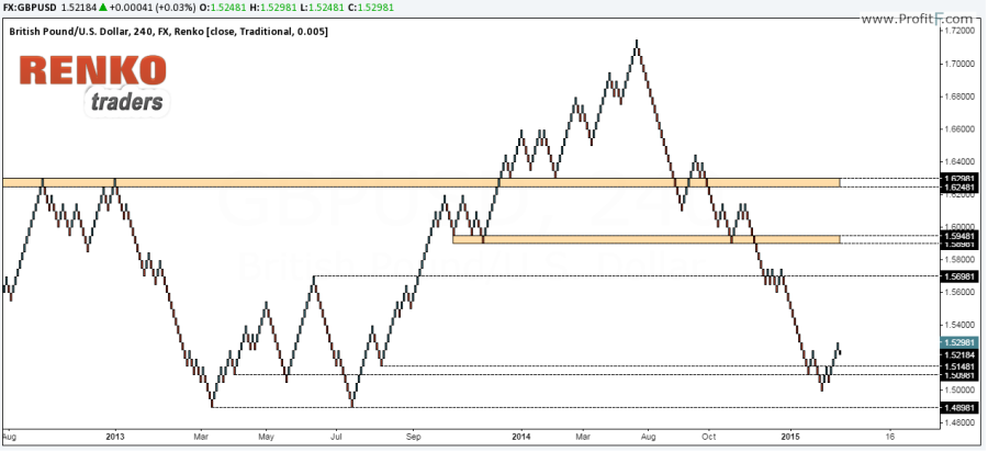
Figure 2: Renko Support and Resistance
In the chart above, Figure 2: Renko Support and Resistance, we notice how simple it is to plot the support and resistance levels. And most interestingly, notice how price reacts to these support/resistance levels to the right side of the chart.
Plotting these same support and resistance levels onto a candlestick chart, we now get the full picture as shown in figure 3 below.
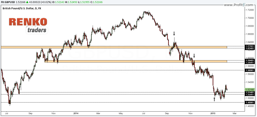
Figure 3: Renko Support and Resistance on Candlestick Charts
The chart shows the support and resistance levels plotted from using Renko charts and using these same levels on candlestick charts. With this approach we can see price action being more responsive. Briefly looking at the chart, we notice that after price broke down from the main support level at the top it failed to close higher and instead broke down below 1.596 thus confirming traders to take a short position targeting the next support level at 1.506, one which would have given some very good profits.
As can be seen from the above example, Renko charts can offer traders a unique perspective of the markets by helping traders to easily identify the support and resistance levels with ease. The lack of “spikes” ensures that the charts are free of any distraction or noise.
About the Author
Ranga, is an experienced Renko chart enthusiast and trades purely using Renko charting. Ranga blogs frequently on his website, renkotraders.com offering tips, advice and strategies based on Renko charts.


 (12 votes, average: 3.25 out of 5)


Add your review